FOR years I have tried to style our in-home Christmas decorations to suit the trend of minimalist elegance.
Choose a principal colour and any add-in colour should be in the shade of the main one – a darker shade or lighter shade. All other decorations should be kept in neutral tones – warm neutrals if the main colour is a warm colour (such as red, orange and yellow), cool neutrals if the main colour is cool (such as green, blue and purple).
And avoid mixing patterns – if you are going to introduce a pattern, only introduce one.
Yet I have faltered every year by wandering through a shop and seeing a decoration I just love, a patterned wrapping paper that is just gorgeous and so on.
But this year, it seems, is my year!
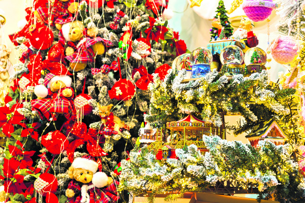
According to the on trend decorators, decorations (if you want to stay on trend) should be a bold mix of patterns, colours and traditional shapes should be mixed with non-traditional – the only calming features should be the ‘background’ decorations.
Those should be in neutral tones to emphasise the bright colours and to pull the whole design together.
Embrace the kitsch, the showy, go unrestrained and have fun.
Now I am liberated from the minimalist theme, I plan to still choose a dominant colour (I love red), introduce a deep green (no surprise there) and go mad with patterns that pick up the two main colours and for neutral tones I’ll use shades of green and beige.